


Chromolume
This post details the creative process behind "Chromolume," a video I created in the fall of 2018. If you haven't seen it yet, that's a good place to start:
I created this piece for a Middlebury Town Hall Theater production of Sunday in the Park with George, a popular musical from the 1980s. It was inspired by Georges Seurat, an 1800s French post-Impressionist artist known for his unique pointillist painting style. The musical revolves around his most famous painting, an 1884 piece called "A Sunday Afternoon on the Island of La Grande Jatte" (you'll probably recognize it):

The musical is split into two acts. The first act stories the creation of the painting, featuring George (a fictionalized version of Seurat) and his relationship with his mistress, Dot. The second act features George's great-grandson of the same name, a 1980s modern artist who creates "light machines." The climax of the act is the unveiling of his latest work, a reflection on his great-grandfather's painting called "Chromolume." It's an avant-garde, over-the-top display that is beautiful but scattered and ultimately misunderstood.
The director, Doug Anderson, approached me to design the media for the production, and creating the Chromolume was my main task. He introduced the project as a blank canvas; the only instruction was to deconstruct the painting, visually riff on its themes for a minute or two, then bring it all back. I relished this open-endedness, since Seurat's unique, science-based style offers so much to explore.
The first decision I made was the music choice, since I wanted it to be a cohesive audiovisual experience. I spliced together an abridged version of one of my favorite songs—Sleep Sound by Jamie XX, from the amazing album In Colour (seemed appropriate). Here's an image of the final product being projected on stage:

This project was an amazing opportunity to incorporate all the software and visual techniques I've been playing with during the past year, from video feedback in Max/MSP/Jitter to Processing code to Leap Motion control to Photoshop editing and After Effects animation (in order of appearance). Many of the scenes involve real-time generated visuals, which is my current creative focus. To use these in a rendered video, I recorded the output with OBS Studio and stitched the scenes together in After Effects. The piece is composed of 6 distinct sections, each with its own concept and creation process. Read on for the details!
Intro
My goal for the first section was to introduce the painting in a visually striking way. I saw this as an opportunity to incorporate Iter, a project I've been developing with Max/MSP/Jitter for the past several months. This patch digitally recreates the "video feedback" effect of pointing a camera at its own feed, allowing me to apply effects iteratively and control them in real-time. I generally use Iter as a visual instrument, improvising dynamic visuals alongside music (check out my Instagram if you're interested).
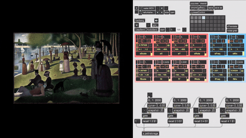
In this case, the image is iteratively scaled up, creating a feedback tunnel effect. I used sin waves to move the tunnel back and forth, creating the wobbling effect that highlights different parts of the image. The red/cyan/magenta colors that fade in are the result of a color-mapping process, which remaps the image's pixel values using a sin function.
To create the 8 bar progression, I've scripted the values of these visual parameters by transitioning between presets. The amazing pattrstorage object in Max allows you to interpolate between saved states of the patch with the "recall" message. I saved four different states (beginning, jump back, sin wave wobble, color map effect), then used the curve object to slowly transition between each. You can check out the process in the gif below. The custom interface I've designed for Iter is in the top right, the scripting patch in the bottom right, and the resulting visuals on the left.
Pointillism
Seurat is best known for developing a painting style called pointillism (or chromoluminarism, as he called it). Instead of mixing paints on a palette to create specific colors, he directly applied primary colors in small, unmixed dots. This technique takes advantage of optical mixing—the human eye automatically perceives groups of adjacent dots as a single color, allowing Seurat to create the full color spectrum without directly mixing paints. The next section of the Chromolume riffs on this pointillist style by continuously redrawing the painting with thousands of dots, rippling in wave-like patterns that follow the music.
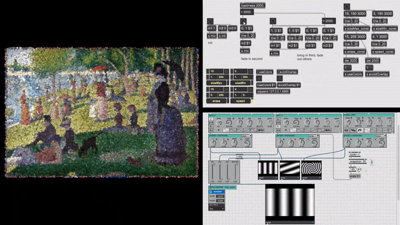
This section involves four different pieces of software working together, which you can see in the gif below. The primary component is a program I developed with Processing, a programming language designed to create visuals. For each frame (at 30 fps), it uses a for-loop to draw a multitude of dots at random points on the screen, using the corresponding color sampled from the painting to fill in the image (you can see the result on the left). The pulsating, wave-like effect is created by varying the size of each dot based on the value of a dynamic "size map." The size map is generated in Max/MSP/Jitter using the amazing Vsynth package, which uses the standard oscillators found in music synthesizers to create visual waveform patterns (bottom right). The map is sent to Processing via Spout, a video frame sharing system for Windows. On top of this interaction, I used another Max patch to control the parameters of the pointillist effect by sending OSC messages to Processing (middle right). A final Max patch is used to script the 8 bar sequence by sending values of line objects to the other two Max patches, mixing in different waveforms and changing the pointillism effect (top right).
Towards the end of the section, the dots get bigger while the number of dots drawn per frame decreases, until there are only 10 large dots left. These are the 10 paint colors that Seurat used to create the piece (source).

Spectrum dance
One of the biggest influences on Seurat's painting style was contemporary scientist Michel Eugène Chevreul, who formulated the law of simultaneous contrast: “Two adjacent colours, when seen by the eye, will appear as dissimilar as possible” (this idea has since been generalized as the contrast effect). Chevreul claimed that by placing two primary or complementary colors next to each other, the eye will perceive a third color that is more luminous and pleasing than the same color achieved through paint mixing. Seurat took this idea to heart by juxtaposing complementary colors throughout the painting, seeking maximum possible luminosity (luminosity means brightness, roughly). Check out this detail of the lounging man's red/orange shirt, which Seurat speckled with blue and green (if you want to see more of the painting close up, check out the amazing Google Arts & Culture page).

While reading about these ideas, I had an image of complementary colors dancing together. My focus in the past year has been controlling visuals with my hands using the Leap Motion controller, and this seemed like a great opportunity to incorporate that work. I developed a Processing sketch that receives hand motion data from a Max patch sending OSC, controlling the position of two colored circles. I recorded a choreographed "dance" with five complementary pairs of colors, then polished and composited the recordings in After Effects. You can see the software setup in the gif below. The bottom left shows an example of the hand choreography, the bottom right shows the hand motion data captured by the Leap Motion, and the top left shows the Max patch that sends this hand data to Processing to control the colored circles.

Within the dance framework, I explored the theme of color mixing, a central concept in Seurat's work and color theory in general. There are two types of color mixing: subtractive and additive.
Subtractive is how paints and pigments interact. The perceived color of a physical substance is determined by which frequencies of the light spectrum it absorbs. An apple, for example, absorbs most of the color spectrum except for red light, which gets reflected into the eye and creates the perception of red. A mixture of two paints retains the absorption properties of both parts, resulting in a darker color that "subtracts" more of the visible spectrum. A mix of all three primary colors (Red+Yellow+Blue for paint or Cyan+Magenta+Yellow for printer ink) appears black.
Additive is how light interacts. The perceived color of light depends on its wavelength, and specific colors are created by a mix of light across the spectrum. Since we're generally only taught the subtractive color wheel, the results of additive color mixing are a bit counter-intuitive (e.g. red + green = yellow). Combinations of two colors result in a brighter color, and a mix of all three primary colors (Red+Green+Blue) results in white.

By using the pointillist style, Seurat avoided the usual subtractive mixing of his medium. Instead, the viewer optically mixes the light being reflected from individual dots, perceiving new colors based on the additive combination. The additive mixing model also determined his color palette; he only used hues found in the solar spectrum, omitting earth colors and black. His aim was to recreate the brightness of colors found in the natural world, and he didn't want subtractive mixing or non-spectral colors to interfere.
To incorporate these ideas, I divided the 8 bar section into two parts. The first section features the 10 paint colors that Seurat used. The circles of "paint" assemble into a color wheel surrounding the Red-Yellow-Blue (RYB) color model, which is the standard for painting. Next, groups of colors form together, revealing close up sections of the painting in which they were used. The colors are swallowed by white then passed through a prism à la Dark Side of the Moon, splitting into the spectral colors that inspired Seurat's palette. At this point, I changed the blend mode in the Processing sketch to be additive, emulating the interaction of light. As a result, the combination of colors gets gradually brighter, transforming into a white canvas for the next section.
color systems
Leading into this section, I included one of Seurat's most famous quotes:
"Some people say they see poetry in my paintings; I see only science."
As you can probably tell, this quote was an important inspiration for me. Every part of Seurat's painting—from the separated dots to the composition to the color palette and combination—was informed by the cutting-edge scientific theories of his time. He believed that color was governed by concrete natural laws, and his artistic mission was to discover and harness them.
With this section, I wanted to create a portrait of Seurat's place within the vast history of color science. I found the amazing resource colorsystem.com, which provides hundreds of diagrams and detailed descriptions for 59 color theories that span human history. Each of these theories and diagrams has its own story and purpose: some attempt to provide exact coordinates for every color, others to create pleasing color solids, explain color harmony, create perceptually uniform metrics, calculate color difference, or provide tools for artists. I think my favorite might be this bizarre system created by David MacAdam in 1944. His goal was to create a warped version of the standard CIE color space in which the distance between colors is "as proportional as possible to their visually perceived differences." Apparently the result failed to meet this goal, but I'd call it a great success.

If you're interested in this stuff, I highly recommend checking out the colorsystem site or reading some ar-ti-cles. I had a blast exploring the rabbit hole.
To create the visuals, I first isolated, color-corrected, and sliced up the diagrams in Photoshop, then animated everything in After Effects. I tried to tie everything to the music, using different rhythms and tempos for each 8 bar section (e.g. the first section is a "round" of shapes moving on quarter notes). The one technique worth mentioning other than standard motion and effect keyframing is the shape morphing section, which I created using frame blending (thanks Eva Davidova for showing me!)
CLIMAX
When I was brainstorming ideas for the climactic section of the song, the director of the musical sent me an important reminder:
"Recall that the audience in the musical admires the Chromolume but in the end, they really don’t get it. They’re standing there scratching their heads, trying to figure out what they just experienced. Your Chromolume needs to be that way – fascinating, gorgeous but also elliptical, hard to grasp, too-much-too-soon. What the heck was he getting at?"
To this end, I tried to make this section fast-paced and slippery, too quick and varied to immediately grasp. It jumps between 4 parts—one for each 8-bar phrase—that feature loosely related themes within the Seurat ballpark:
The first part features a 3D color model, the modern evolution of the preceding hand-drawn diagrams. I combined screen-recordings of software called ColorThink Pro, which graphs ICC profiles of color spaces and supports a variety of viewing options (like solid vs. wireframe and vertex resolution).
The second part features a host of optical illusions that highlight the simultaneous contrast effect: the same color looks different if it's in shadow, a color appears differently depending on the color of its surroundings, and contrasting color can create a false perception of movement. If you're interested, it's worth pausing the video before and after each reveal to see how your perception changes. You can also check out a classification of color illusions or a TED talk about how this relates to the brain.
The third part riffs on human color perception, featuring macro footage of an eye. The human retina contains 3 types of cone cells that allow us to perceive color, each of which is sensitive to a different frequency range of the light spectrum. The peak sensitivities of the three cones are roughly red, green, and blue, and every color we see is the result of a specific combination of cone activation (for the record, three cones is not biologically universal. Check out the mantis shrimp, which can have 12-16 types of cones!). I animated a graph of the frequency response curves for each cone, then changed the saturation of the eye+color wheel graphic to demonstrate the effect on our vision.
The fourth and final part extends the theme of color perception by showing a colorful, artistic representation of the brain activity that makes it all happen. It's fascinating to think that colors don't really exist out there in the world—it's all a construction of the brain, an evolutionarily advantageous way to process the information our eyes receive. I combined clips from an amazing project called "Self Reflected," created by Dr. Greg Dunn and Dr. Brian Edwards with a novel technique called reflective microetching.
Pixel zoom
Seurat's pointillist approach was not only beautiful but prescient. By painting with distinct dots of primary colors, he took advantage of optical mixing in the same way as the modern pixel. If you take a close look at the pixels of any screen (including this one), you'll see tiny, individual lights of red green and blue (check out this Slow Mo Guys video for proof). Every color is achieved by a linear combination of these three primary colors, just as Seurat was able to create a full spectrum in his painting.
The final section serves to highlight this connection and the legacy of Seurat's work. I wanted the audience to realize that their own viewing of this piece depends on the same color science that inspired Seurat. It also completes the loop of visual deconstruction, zooming out to the starting point of the original image. I created the animation in After Effects with help from this awesome tutorial.
And there you have it! If you've made it this far through this arguably-too-detailed breakdown, I appreciate your time and interest. Many thanks to director Doug Anderson, production manager Mary Longley, technicians Joe Plotts and Ken Hypes, and the cast of Middlebury students for providing such a cool opportunity and giving the project a stage.